Corporate materials communicate your brand's identity at every professional interaction. They range from business cards and letterhead to proposals and presentation folders. Each material type carries specific design requirements and communication objectives. Understanding these requirements helps you create materials that are genuinely impactful. Impactful corporate materials build credibility, reinforce brand identity, and win more business. These design tips give you a strategic framework for every corporate material decision.
The Foundation of Impactful Corporate Design
Impactful corporate design begins with a clearly defined design strategy. Without strategy, individual design decisions become disconnected and inconsistent. A coherent corporate design strategy guides every material from letterhead to folders. It defines the visual language that represents your brand across all touchpoints. This language includes colors, fonts, spacing principles, and imagery guidelines. A well-defined strategy ensures every material strengthens the overall brand impression.
Defining Your Corporate Visual Identity
Your corporate visual identity is the foundation of all material design decisions. It includes your primary and secondary brand colors in precise specifications. It defines the typefaces used across all corporate communications. It establishes your logo usage rules, minimum sizes, and clear space requirements. It specifies the photographic and illustrative styles that represent your brand. This identity framework ensures consistency regardless of who designs any given material.
The Role of Brand Guidelines in Material Design
Brand guidelines document your visual identity decisions for consistent application. They serve as the definitive reference for every design decision across all materials. Designers working on any corporate material should consult the guidelines first. Guidelines prevent inconsistency caused by individual interpretation and preference. They ensure that materials produced across different designers and agencies feel coherent. Maintaining and updating guidelines is essential to the long-term impact of your corporate design.
Design Principles That Maximize Corporate Material Impact
Certain universal design principles apply across all corporate material types. These principles have been refined through decades of professional design practice. Applying them consistently produces materials that are polished, professional, and impactful. Violating them produces materials that feel amateurish regardless of the quality of execution. Understanding these principles is the most important design education for any business professional.
Visual Hierarchy and Information Architecture
Visual hierarchy guides the viewer's eye through your design in a purposeful sequence. The most important information — typically your logo or headline — should command the most visual weight. Secondary information like contact details or supporting text appears in reduced scale. Tertiary information sits at the smallest scale within the composition. This hierarchy ensures the viewer processes information in the intended order. A clear, well-executed hierarchy makes corporate materials instantly navigable and professionally credible.
White Space as an Impact Amplifier
White space is one of the most powerful tools in corporate design. Generous negative space creates breathing room that elevates every design element. Crowded corporate materials look desperate and communicate lack of design confidence. White space communicates that your brand is secure and doesn't need to over-explain. Premium brands universally use more white space than their competitors. Adding white space to your corporate materials immediately elevates their perceived quality.
Color Strategy for Corporate Materials
Color strategy in corporate materials balances brand expression with professional credibility. Your primary brand color should dominate the visual hierarchy consistently. Secondary colors add supporting interest without competing with the primary. Limit your palette to two or three colors for the strongest, most coherent impact. Overly complex color palettes in corporate materials communicate visual confusion. Simple, purposeful color strategies produce the most consistently impactful corporate results.
Business Card Design for Corporate Impact
Business cards are your most personal and frequently exchanged corporate material. Their design must balance brand expression with professional clarity. Every element must earn its place on this small but powerful branding surface. Design discipline — knowing what to include and what to remove — is essential. The most impactful business cards are often the simplest and most deliberately composed. Restraint and clarity are the defining qualities of genuinely impactful card design.
Typography Choices for Professional Card Design
Typography is the most concentrated brand signal on any business card. Your name and title should appear in a well-chosen, brand-appropriate typeface. Avoid decorative fonts that compromise readability for the sake of style. A clean sans-serif for contact details paired with an elegant serif for the name creates sophisticated hierarchy. Font sizes should be large enough to read comfortably without squinting. Typography choices should be consistent with all other corporate materials.
Information Architecture on Corporate Business Cards
What you include on a business card is as important as how you design it. Include only the information that serves the recipient in following up with you. Name, title, company name, phone, email, and website are typically sufficient. Removing social media handles and secondary contact information creates cleaner impact. A card with fewer, more important elements always looks more professional. Edit ruthlessly and trust that the essential information is enough.
Presentation Folder Design for Maximum Corporate Impact
Presentation folders house your most important corporate documents and proposals. Their design must project authority, professionalism, and aligned brand identity. The folder is the first physical impression of your proposal content. Its quality either primes positive evaluation or creates credibility deficit immediately.
Investing in professional presentation folder printing ensures your design vision is realized with the quality that corporate materials demand. Professional printing achieves color accuracy, finish consistency, and material quality beyond self-printing capabilities. These qualities are immediately apparent to clients who handle your folders regularly. The professional quality communicates your brand's commitment to excellence at every interaction.
Cover Design Principles for Corporate Folders
The folder cover must communicate brand identity with confident simplicity. Your logo should be the dominant element, correctly sized and carefully positioned. A brand color field or subtle pattern can reinforce visual identity without cluttering. The cover should feel premium, intentional, and reflective of your brand's character. Supporting text — a tagline or your primary service offering — can add strategic context. Resist the temptation to include too much information on the cover design.
Interior Layout and Navigation Design
The interior of a corporate folder should be designed for intuitive content navigation. Pocket placement should guide the reader through content in the intended sequence. Color-coded pocket or section dividers create visual navigation cues. Page inserts should be designed with consistent margins and typography to the folder. A business card slot positioned for easy access adds functional elegance. Interior design coherence with the cover creates a complete, polished corporate material system.
Letterhead and Stationery Design Tips
Corporate letterhead is used in every formal written communication your business produces. Its design creates a branded context for every proposal, letter, and document. Quality letterhead design balances brand identity with the practical needs of document use. The header area should be strong and clearly branded without consuming excessive page space. Margins should be generous for easy reading and professional printing. Footer information should be complete but scaled to not compete with the document content.
Creating a Cohesive Stationery Suite
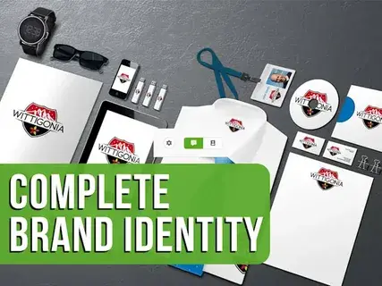
A complete, cohesive corporate stationery suite creates cumulative brand impact. Letterhead, envelopes, notepads, business cards, and folders should share visual DNA. Consistent colors, fonts, and design language across all items creates a unified impression. Clients who encounter multiple matching materials feel confidence in the brand's coherence. This coherence communicates organized, mature brand management. Designing all stationery items together rather than individually ensures the strongest possible suite cohesion.
Printing Quality as a Design Element
Printing quality is itself a design variable that affects corporate material impact. Even excellent design is undermined by poor printing quality. Color accuracy is essential — your brand colors must reproduce exactly as specified. Crisp, sharp edges on all printed elements communicate professional production standards. Surface finish choices — matte, gloss, or soft-touch — affect the overall design impression. Treating printing quality as a design decision ensures your corporate materials achieve their full intended impact.
 Venues